
Colleges
- American Athletic
- Atlantic Coast
- Big 12
- Big East
- Big Ten
- Colonial
- Conference USA
- Independents (FBS)
- Junior College
- Mountain West
- Northeast
- Pac-12
- Patriot League
- Pioneer League
- Southeastern
- Sun Belt
- Army
- Charlotte
- East Carolina
- Florida Atlantic
- Memphis
- Navy
- North Texas
- Rice
- South Florida
- Temple
- Tulane
- Tulsa
- UAB
- UTSA
- Boston College
- California
- Clemson
- Duke
- Florida State
- Georgia Tech
- Louisville
- Miami (FL)
- North Carolina
- North Carolina State
- Pittsburgh
- Southern Methodist
- Stanford
- Syracuse
- Virginia
- Virginia Tech
- Wake Forest
- Arizona
- Arizona State
- Baylor
- Brigham Young
- Cincinnati
- Colorado
- Houston
- Iowa State
- Kansas
- Kansas State
- Oklahoma State
- TCU
- Texas Tech
- UCF
- Utah
- West Virginia
- Illinois
- Indiana
- Iowa
- Maryland
- Michigan
- Michigan State
- Minnesota
- Nebraska
- Northwestern
- Ohio State
- Oregon
- Penn State
- Purdue
- Rutgers
- UCLA
- USC
- Washington
- Wisconsin
High School
- Illinois HS Sports
- Indiana HS Sports
- Iowa HS Sports
- Kansas HS Sports
- Michigan HS Sports
- Minnesota HS Sports
- Missouri HS Sports
- Nebraska HS Sports
- Oklahoma HS Sports
- Texas HS Hoops
- Texas HS Sports
- Wisconsin HS Sports
- Cincinnati HS Sports
- Delaware
- Maryland HS Sports
- New Jersey HS Hoops
- New Jersey HS Sports
- NYC HS Hoops
- Ohio HS Sports
- Pennsylvania HS Sports
- Virginia HS Sports
- West Virginia HS Sports
ADVERTISEMENT
Install the app
How to install the app on iOS
Follow along with the video below to see how to install our site as a web app on your home screen.
Note: This feature may not be available in some browsers.
You are using an out of date browser. It may not display this or other websites correctly.
You should upgrade or use an alternative browser.
You should upgrade or use an alternative browser.
Uniform Combo for Saturday's Game vs. Nevada
- Thread starter ScottHood
- Start date
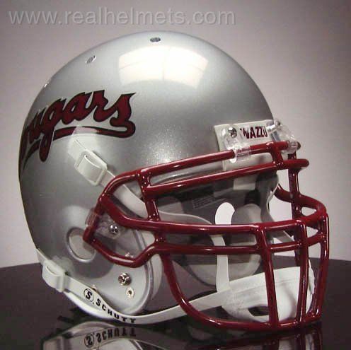
in general, i like this year's uni combos. i'm always in the "less is more" camp so i like that they got rid of the shoulder accents, piping around the numbers, and replaced the front nameplate w/ a simple cougar head. the anthracite is the one exception to this for me though. w/o all those accents, it just looks like a practice jersey to me. i bet it'd be different if the lettering/numbers/logo were crimson instead of white. same w/ that anthracite helmet. it would probably look a lot better w/ a crimson logo/facemask instead of the white.
whatever... no big deal, just an observation.
whatever... no big deal, just an observation.
I like them. My only complaint is that we just wore grays last weekend. Different combo, sure. But I would have liked to save these for later. Slick look though.
Filfthy. The White Is much better than the Crimson for the numbers and logo because you can actually see them. Nike...took them a while but they finally nailed it.

I.... sometimes wish we had our old silver helmets back... There, I said it.
They'd look pretty dope with this look.
I.... sometimes wish we had our old silver helmets back... There, I said it.
 university%252F&source=iu&pf=m&fir=07aZJh92aX09mM%3A%2CsFrM0x8lfTUfmM%2C_&usg=__Csw_hC3guUvyDJ9c4OtiOZz-AO4=&biw=1097&bih=543&ved=0ahUKEwi38-SmnLnWAhVW2GMKHepxBvcQyjcINQ&ei=WTvFWffiGdawjwPq45m4Dw#imgrc=xZ99G7dq2gXU6M
you mean the silver helmet w/ the anthracite jersey and white pants? if so, cannot agree w/ you there...They'd look pretty dope with this look.
you mean the silver helmet w/ the anthracite jersey and white pants? if so, cannot agree w/ you there...
Yeah, maybe not the best thinking of it now. I can't really say I'm a huge fan of the white pants unless they're the Icy Whites (which I think drop for the 1st road game against Oregon).
ok, i take it back... i dug the look a lot. i think it was the grey logo and facemask on the helmet (rather than the typical crimson). it kinda looked like the team was in black and white while everything around them was in color. i wouldn't want to see it all the time, but it definitely worked.
Similar threads
- Replies
- 8
- Views
- 624
- Replies
- 14
- Views
- 516
- Replies
- 24
- Views
- 1K
- Replies
- 11
- Views
- 431
ADVERTISEMENT
ADVERTISEMENT